The TapToTalk app sizes pictures on a page to make the best use of screen space. The fewer pictures on a page, the larger they appear, and vice-versa. This works just fine for most TapToTalk users, but some do better when there are the same number of pictures, all the same size, on every page. The uniformity helps them focus.

page 1
It's easy to make a uniform grid in TapToTalk Designer. First, decide how many pictures you want on each page. In this example, we chose six. That's the maximum number of pictures we'll use per page in our album.

emotion
picture
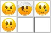
On the first page, we have six pictures to use. But when the emotion picture is tapped, we want it to lead to a page that only has four emotion pictures. So we added two placeholder pictures to complete our six-picture grid. We chose the "white" picture from the "colors" category in Designer's picture library, but you can use any picture that works for you.

emotions page
Now our emotions page has four emotion pictures and two white squares fill out the six-picture grid.
If you use this technique, you'll probably want to be sure the placeholder pictures have no captions and no sounds (though we know one customer who makes the placeholder pictures say "Oops!" if tapped).


